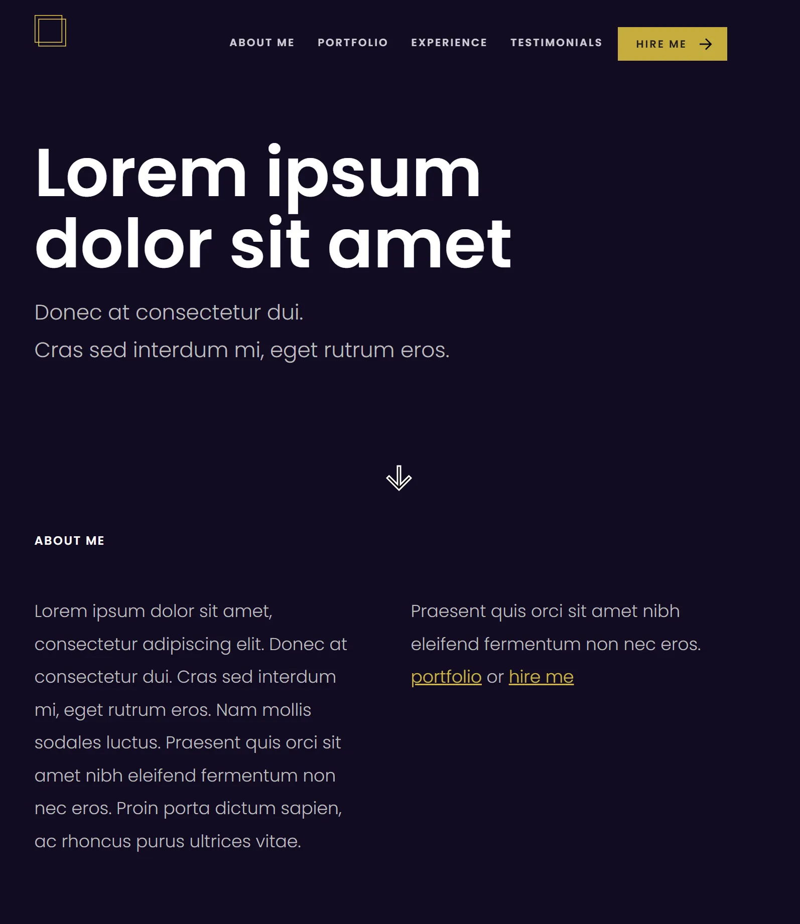
A fully responsive, single-page portfolio website developed as part of a front-end course, built entirely from scratch using HTML and CSS, without frameworks or templates.
The project focuses on semantic HTML, accessibility best practices, and scalable CSS architecture, applying real-world front-end development principles.
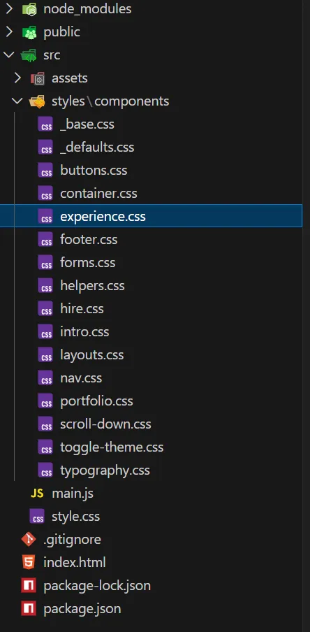
Structure & Layout
The website is divided into clearly defined sections, each treated as an independent UI component:
- About Me
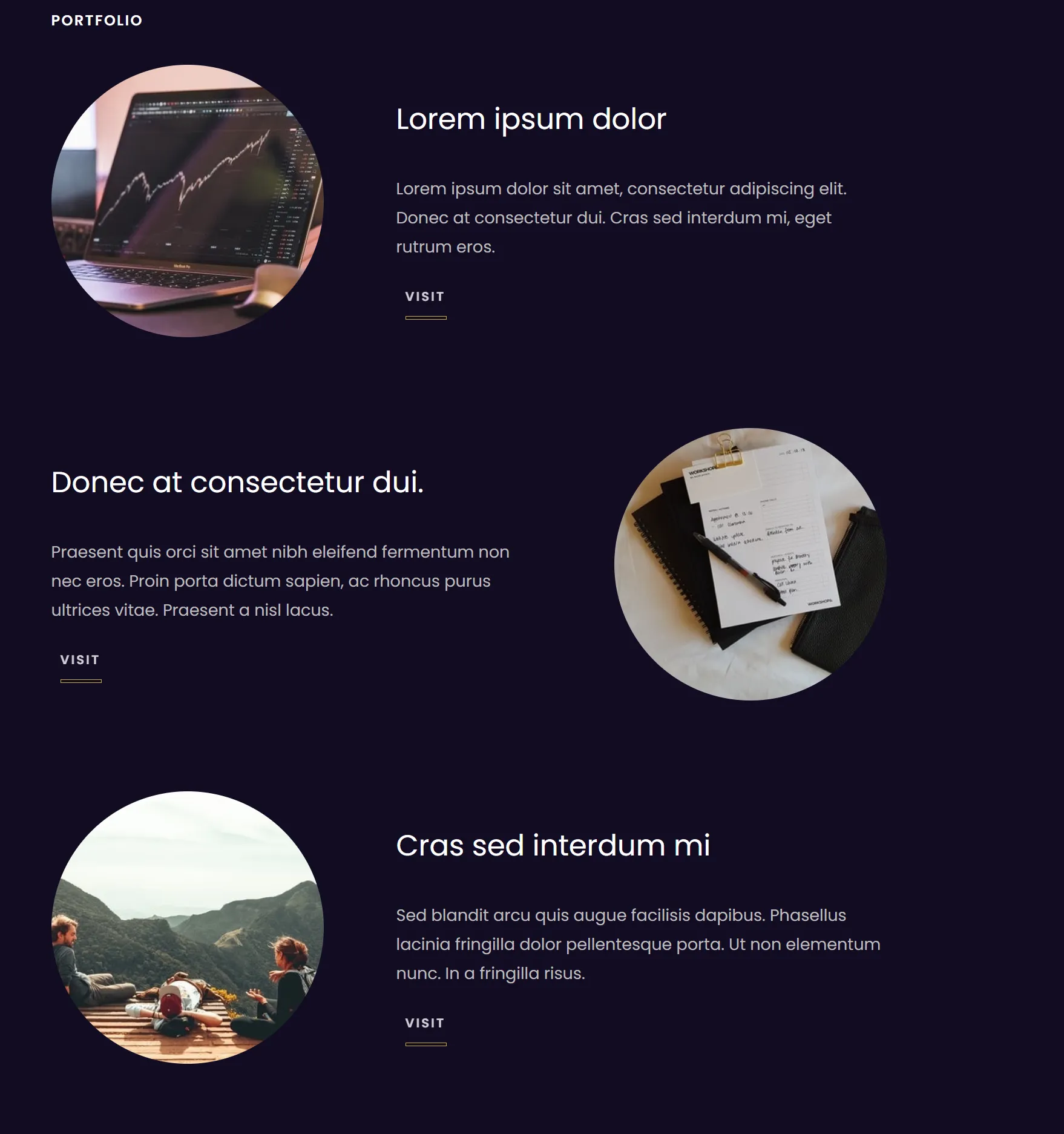
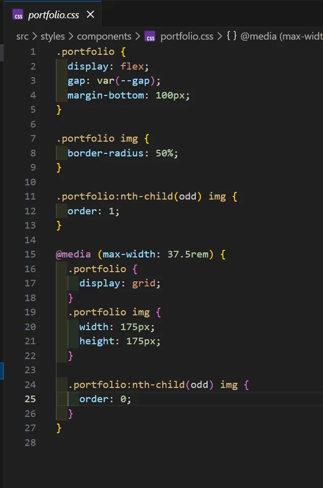
- Portfolio
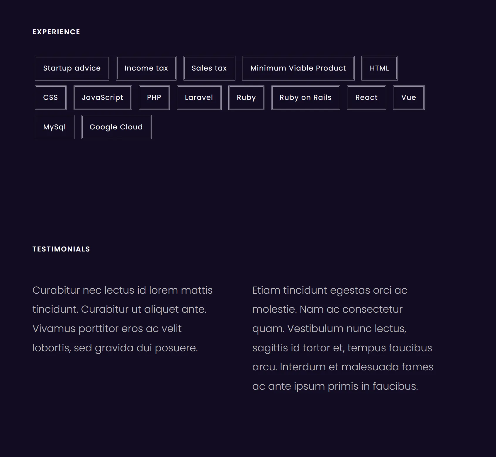
- Experience
- Testimonials
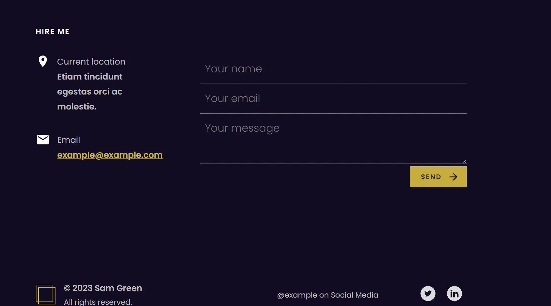
- Hire Me (custom contact form)
The layout was designed to be clean, readable, and fully responsive across different screen sizes.
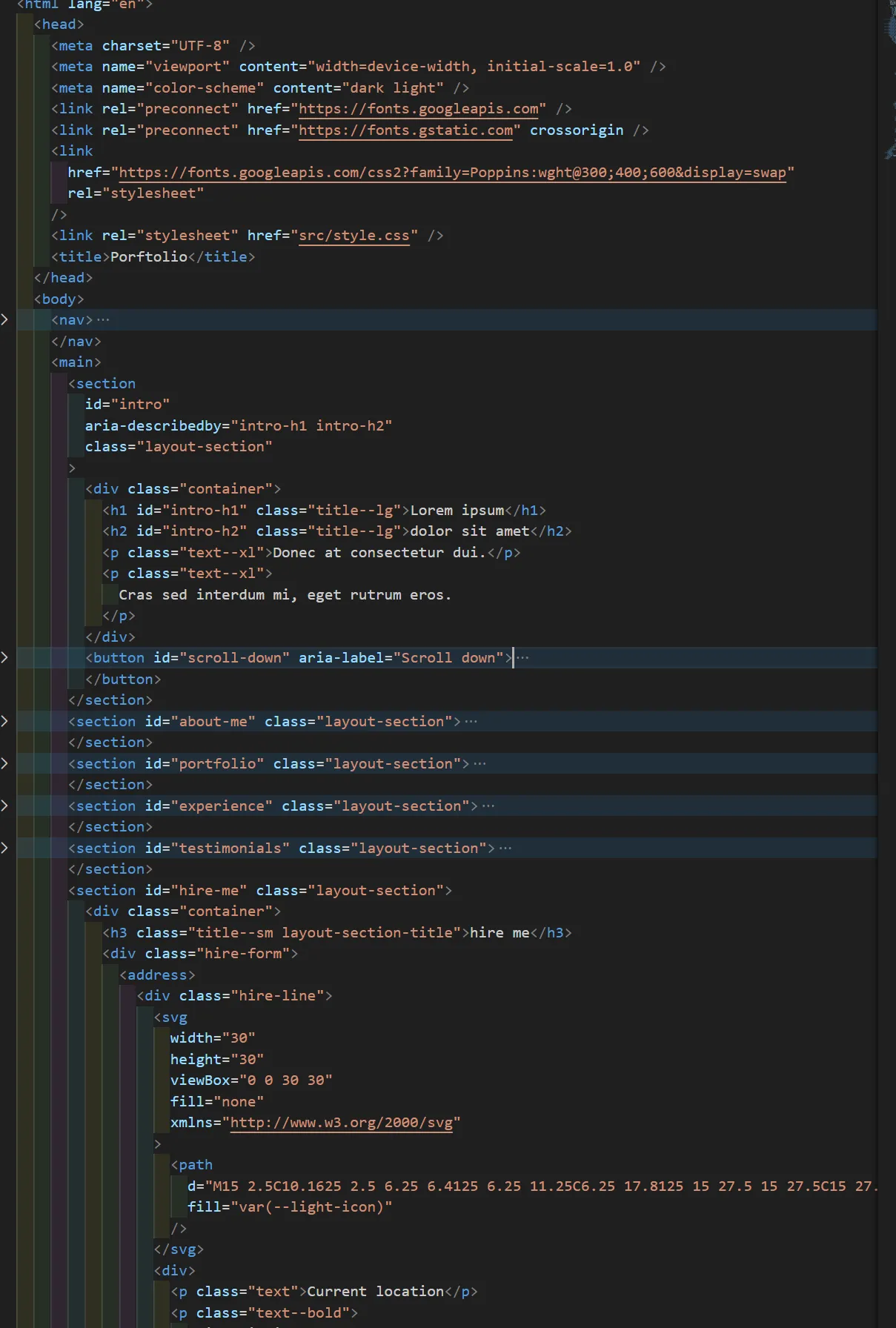
Accessibility & Semantic HTML
Accessibility and semantic structure were core considerations throughout the project:
- Use of semantic HTML elements, including
<address> - Implementation of
aria-describedbyattributes to improve form accessibility - Clear content hierarchy and meaningful markup to enhance screen-reader support
CSS Architecture & Styling
CSS styles were organized into multiple files to improve maintainability and scalability:
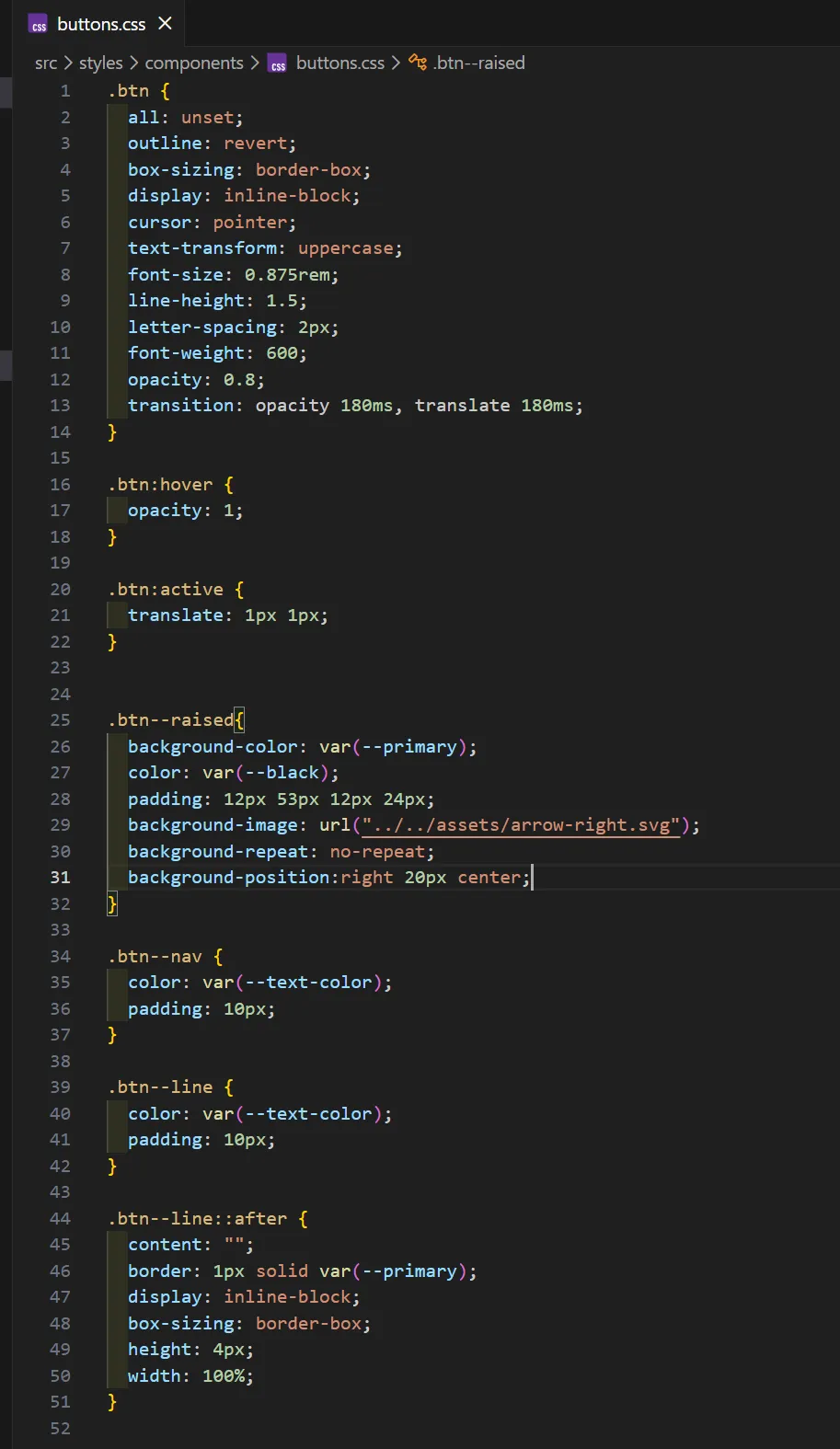
- Section-based styles (intro, portfolio, experience, hire me)
- Component-based styles (buttons, forms, typography)
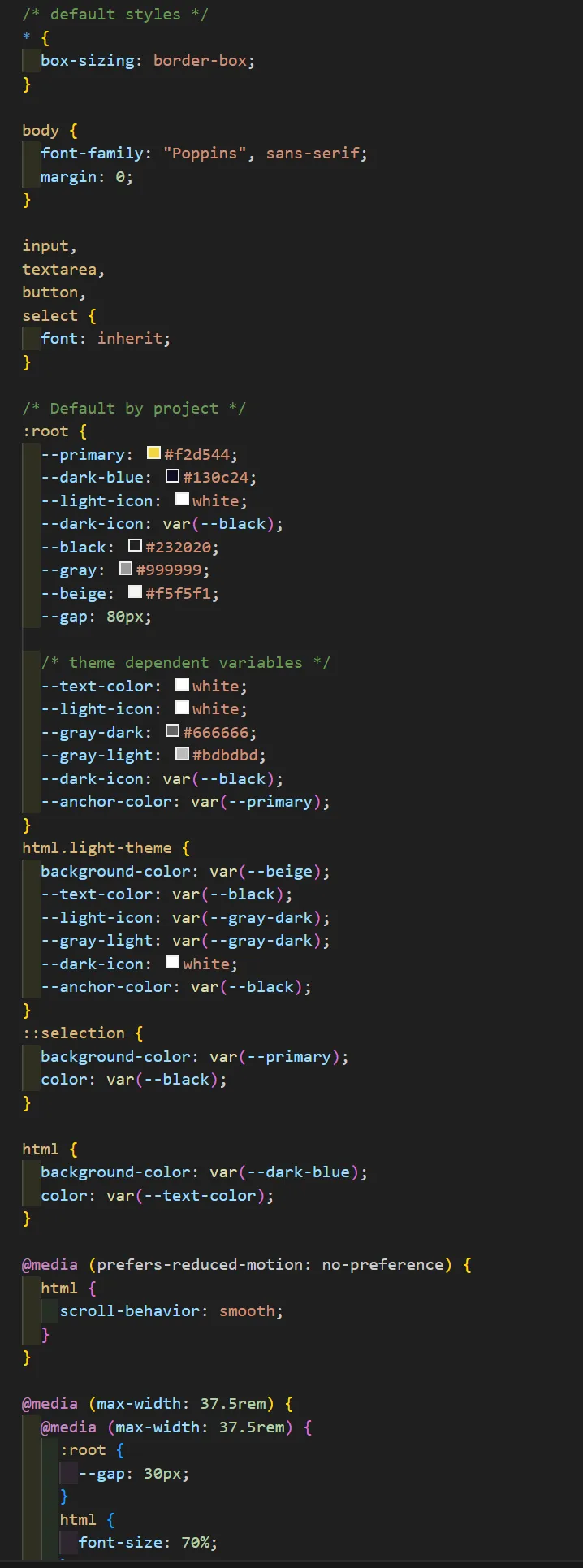
- A shared base file containing CSS variables for colors and core styling
Layouts were implemented using Flexbox and CSS Grid, following modern responsive design practices.
UI Features & Responsiveness
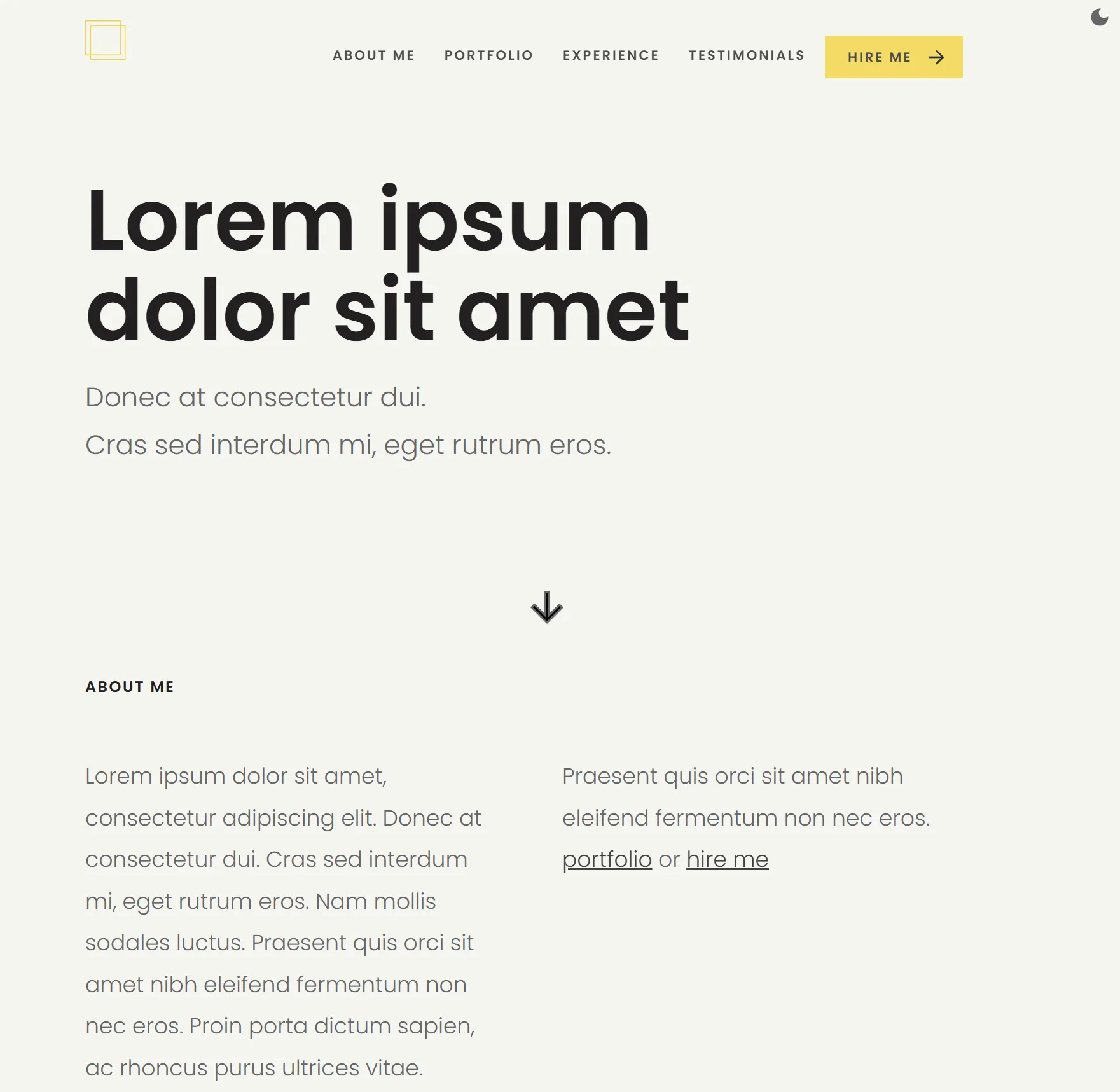
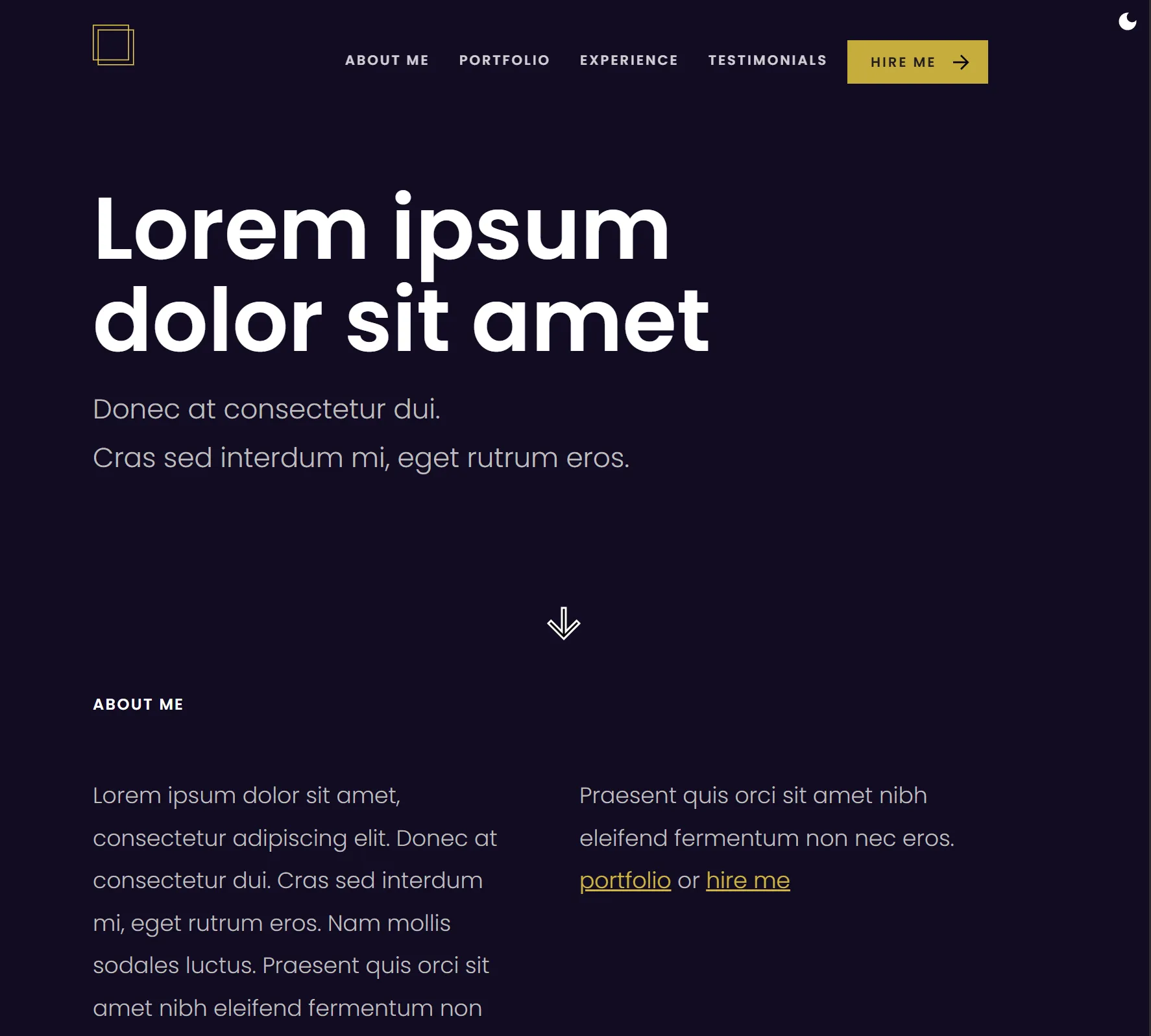
The project includes a light and dark mode toggle, implemented using CSS variables.
Color variables are reassigned across breakpoints to maintain visual consistency and usability on different devices.
Light mode
Dark mode
Responsive